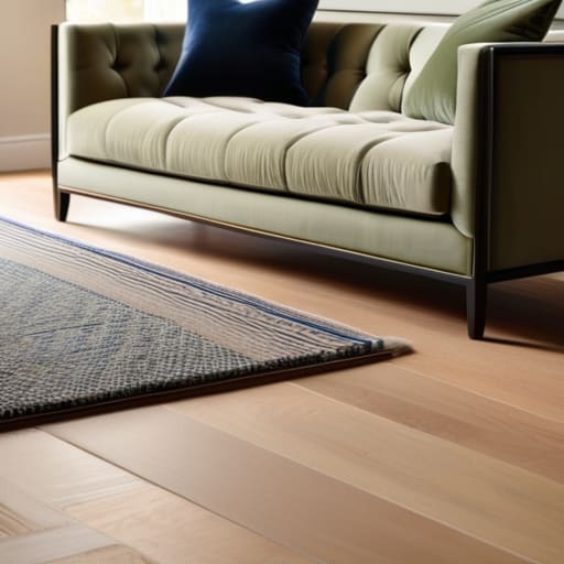
How to Choose a Color Scheme for Any Room
I was walking along a jagged stretch of the Maine coast last autumn, my pockets heavy with fragments of frosted green and cobalt sea glass, when it hit me how much we overcomplicate design. We’ve been sold this lie that picking a palette requires expensive mood boards or a degree in fine arts, but that’s just noise. Most people get paralyzed by the sheer volume of swatches at the store, forgetting that the most beautiful combinations aren’t manufactured—they’re found. If you’re staring at a wall of beige wondering how to choose a color scheme that doesn’t feel sterile or soul-less, you aren’t alone, and you certainly don’t need a massive budget to fix it.
I’m not here to give you a list of fleeting trends that will feel dated by next season. Instead, I want to share a more intentional approach: one that blends digital precision with the organic wisdom of the natural world. I’ll show you how to pull inspiration from the textures around you to create a space that feels both curated and deeply alive. We’re going to strip away the hype and focus on building a palette that reflects your personal values and brings a sense of sustainable harmony to your home.
Table of Contents
Mastering Color Theory for Interior Design and Soulful Spaces
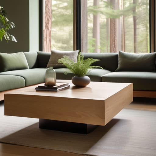
When we dive into color theory for interior design, it’s easy to get lost in technical charts and rigid rules. But I like to think of it more like the way sunlight hits the ocean—it’s about how colors dance together to create a specific feeling. Instead of just picking shades you like, consider the psychology of color in home decor. Are you looking to create a sanctuary that feels like a quiet morning in a pine forest, or a vibrant space that mimics the energy of a summer tide?
To find that perfect balance, I often play with complementary color combinations to add depth without overwhelming the senses. If you’re leaning toward a more grounded, earthy vibe, you might pair deep mossy greens with soft, sandy ochres. However, if you want to experiment with temperature, pay close attention to the interplay between warm vs cool color tones. A room filled with cool blues can feel incredibly tranquil, but adding a touch of terracotta or reclaimed wood can prevent it from feeling too clinical. It’s all about finding that sweet spot where your space feels both intentional and alive.
Exploring Warm vs Cool Color Tones in Natures Light

When I’m walking along the shoreline in Maine, I’m constantly struck by how the light dictates the mood of the landscape. In the golden hour, the sand and dunes glow with a comforting radiance, whereas a misty morning turns the entire coast into a sanctuary of soft blues and muted greys. This natural dance between warm vs cool color tones is exactly what we should bring into our living spaces. Warm tones—think terracotta, ochre, or soft sand—can make a room feel like a sun-drenched afternoon, fostering a sense of intimacy and energy.
On the flip side, cool tones like sage green or slate blue offer a refreshing, calm clarity, much like the deep Atlantic on a crisp day. Understanding the psychology of color in home decor allows you to curate an atmosphere that matches your internal rhythm. If you’re looking to create a space for deep focus or relaxation, leaning into those cooler hues can be transformative. However, the real magic happens when you balance them, using a touch of warmth to prevent a room from feeling too sterile, much like how a piece of amber sea glass brings life to a pale, sandy shore.
Five Ways to Curate a Palette That Breathes
- Look to your local landscape for a foundation. Instead of scrolling through endless digital swatch books, step outside and observe how the moss interacts with granite or how the sunset bleeds into the Atlantic; nature never gets a color combination wrong, and neither should your home.
- Embrace the 60-30-10 rule to find your rhythm. Aim for a dominant neutral (60%) to keep things airy, a secondary supporting hue (30%) for depth, and a bold, intentional accent (10%)—think of it like a single piece of vibrant sea glass resting against a muted sandy shore.
- Test your colors against the sun’s daily journey. A shade that feels like a warm hug in the morning light might turn moody and heavy by twilight, so always observe how your chosen tones shift as the natural light moves through your space.
- Prioritize texture to prevent a flat aesthetic. A monochromatic scheme doesn’t have to be boring if you layer organic materials like reclaimed wood, linen, or woven jute; these tactile elements allow color to feel lived-in and soulful rather than clinical.
- Choose colors that reflect your personal intention. Ask yourself how you want a room to feel—should it be a high-energy hub for creativity or a quiet sanctuary for reflection? Let your emotional response to a color guide your choice more than any fleeting digital trend.
Bringing It All Together: Your Sustainable Color Roadmap
View your color palette through the lens of intention rather than trend; aim for tones that feel as organic and enduring as the weathered textures of the Maine coast.
Balance your space by layering warm and cool tones to mimic the natural shift of sunlight, ensuring your home feels alive and responsive to the time of day.
Use color as a tool for storytelling, selecting hues that don’t just decorate a room, but reflect the environmental values and soulful peace you want to cultivate in your daily life.
The Soul of the Palette
Choosing a color scheme shouldn’t feel like a math problem to solve; it should feel like a conversation with your surroundings—selecting hues that resonate with the same effortless intention you see in the shifting tides or the moss clinging to a coastal stone.
Jordan Mitchell
Bringing Your Vision Home
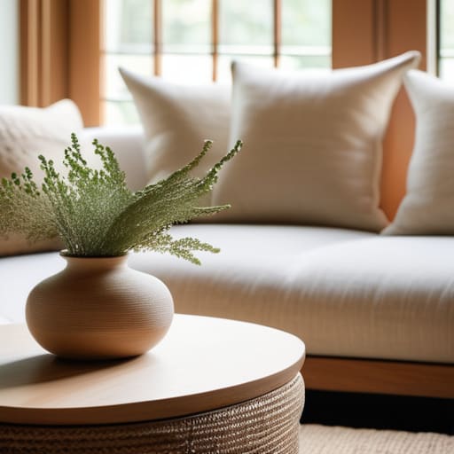
As we’ve explored, choosing a color scheme isn’t just about following a trend or picking what looks good on a digital screen; it’s about understanding the delicate interplay between light, emotion, and the natural world. By mastering the fundamentals of color theory and leaning into the organic balance of warm and cool tones, you can create a space that feels both intentional and deeply restorative. Remember to view your palette through the lens of nature’s own rhythms—whether you are drawing inspiration from the muted, calming neutrals of a foggy Maine morning or the vibrant, sun-drenched hues of a coastal summer. When you align your interior choices with these elemental truths, you move beyond mere decoration and begin to curate a truly soulful sanctuary.
Ultimately, I want you to remember that your home is a living, breathing reflection of your values and your journey. Don’t feel pressured to achieve perfection on your first attempt; instead, treat your design process like a slow walk along the shore, gathering pieces of inspiration as you go. Whether you are repurposing old furniture or selecting sustainable textiles, every choice is an opportunity to weave your personal story into your surroundings. Let your color palette be a testament to a life lived with purpose and intention. Trust your intuition, embrace the beauty of imperfection, and know that even the smallest shift in tone can transform your environment into a place of profound peace.
Frequently Asked Questions
How can I balance my desire for a trendy, modern aesthetic with a color palette that feels timeless and grounded in nature?
Think of it like a piece of driftwood found on a Maine beach: it’s weathered and organic, yet it fits perfectly in a modern, minimalist room. To strike that balance, anchor your space with “earth-core” neutrals—think mossy greens, sandy beiges, or slate greys. These act as your timeless foundation. Then, layer in those trendy, high-contrast accents through small, intentional pieces like a terracotta vase or a bold, recycled-glass lamp. It’s about blending the fleeting with the permanent.
If I'm working with a small or dimly lit space, which sustainable paint finishes or tones will help maximize natural light without feeling cold?
When you’re navigating a cramped or shadowy nook, think of light as a precious resource to be harvested. I love using soft, creamy whites or pale, sandy ochres—tones that mimic the gentle glow of a Maine sunrise. Opt for a satin or eggshell finish; they have just enough luster to bounce light around the room without that sterile, clinical chill. It’s about capturing warmth while letting the light dance.
How do I incorporate bold, statement colors into my home without overwhelming the calming, eco-conscious vibe I'm trying to create?
Think of bold colors like a sudden burst of wildflowers against a muted coastal landscape—they should punctuate, not overpower. Instead of painting an entire room, try “color dabbing.” Use a deep forest green or a rich terracotta in small, intentional doses: a single velvet cushion, a piece of reclaimed wood art, or even a ceramic vase. By grounding these vibrant accents with plenty of natural textures and neutral, earthy tones, you create energy without losing that essential sense of calm.
